Ámsterdam (Países Bajo) 2015 9.922 m2
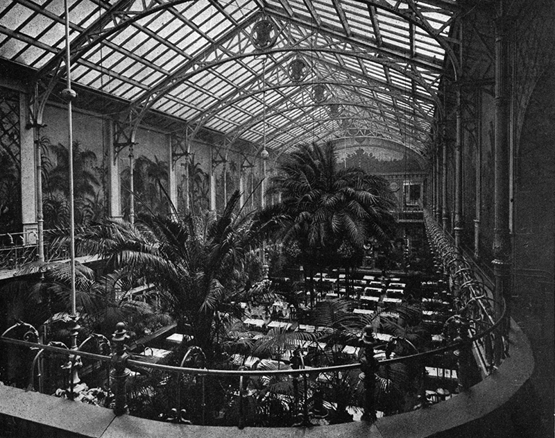
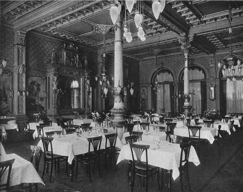
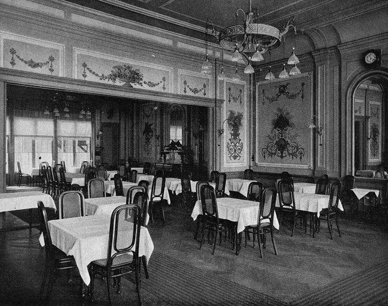
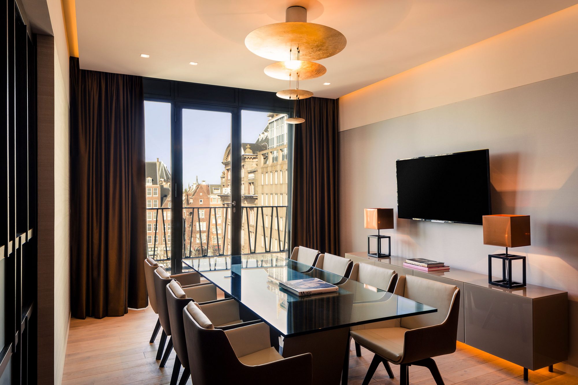
Located in the Dam square of Amsterdam, with views of the Royal Palace, the Grand hotel Krasnapolsky is located between the most emblematic buildings of the city. Its origin dates back to 1865, already then being the central enclave of the high society of that time.
A historical hotel
Adolph Wilhelm Krasnapolsky, the first owner of the hotel that bears his name, redefined the luxury hotel experience by establishing the minimum requirements of proper accommodation. In domestic terms, making the Krasnapolsky Grand Hotel become synonymous to luxury without ostentation.
Loss of the identity
After numerous expansions and reforms throughout its 150 years, it currently occupies eight buildings that meet 36.391 m². Each of the succeeding transformations displays the style of its time engendering a distinct environment and an incoherent personality losing completely the unique identity that characterized it.
The objective of the intervention has been to give a new identity to the hotel based on the elements of value in its history and its surroundings.Ramón Esteve
The Krasnapolsky red
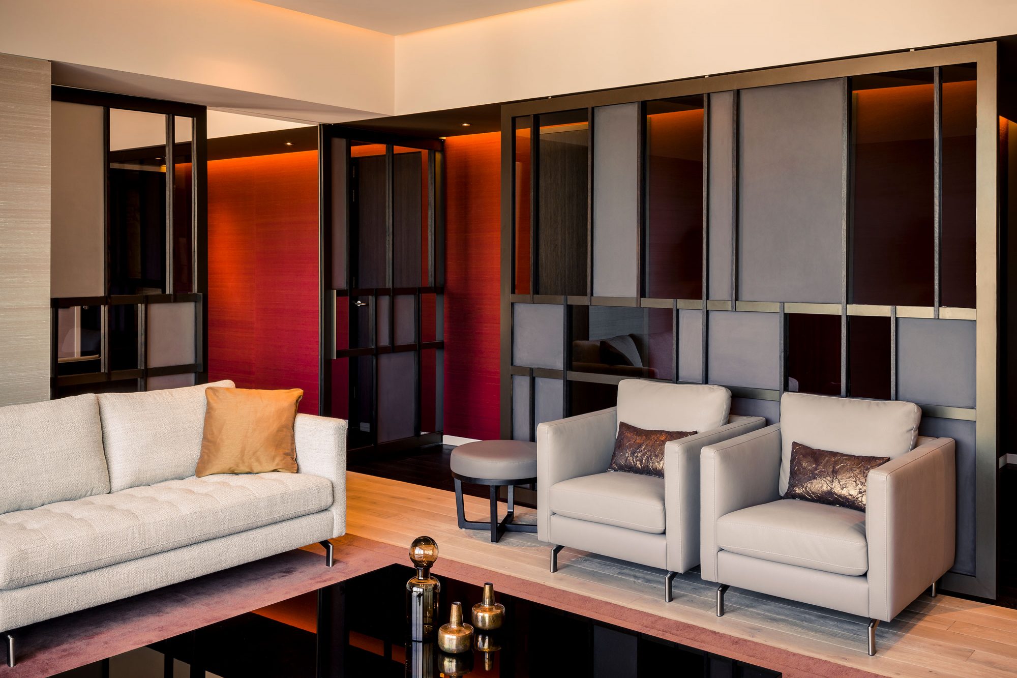
It has taken as reference, the dark brick facades characteristics that govern in the city of Amsterdam, the costumbrist painting by Vermeer or the “Red Krasnapolsky” which is mentioned in James Joyce’s Finnegans Wake, as well as the art-deco feel, which reigned in the hotel also described in his novel.
Room typologies
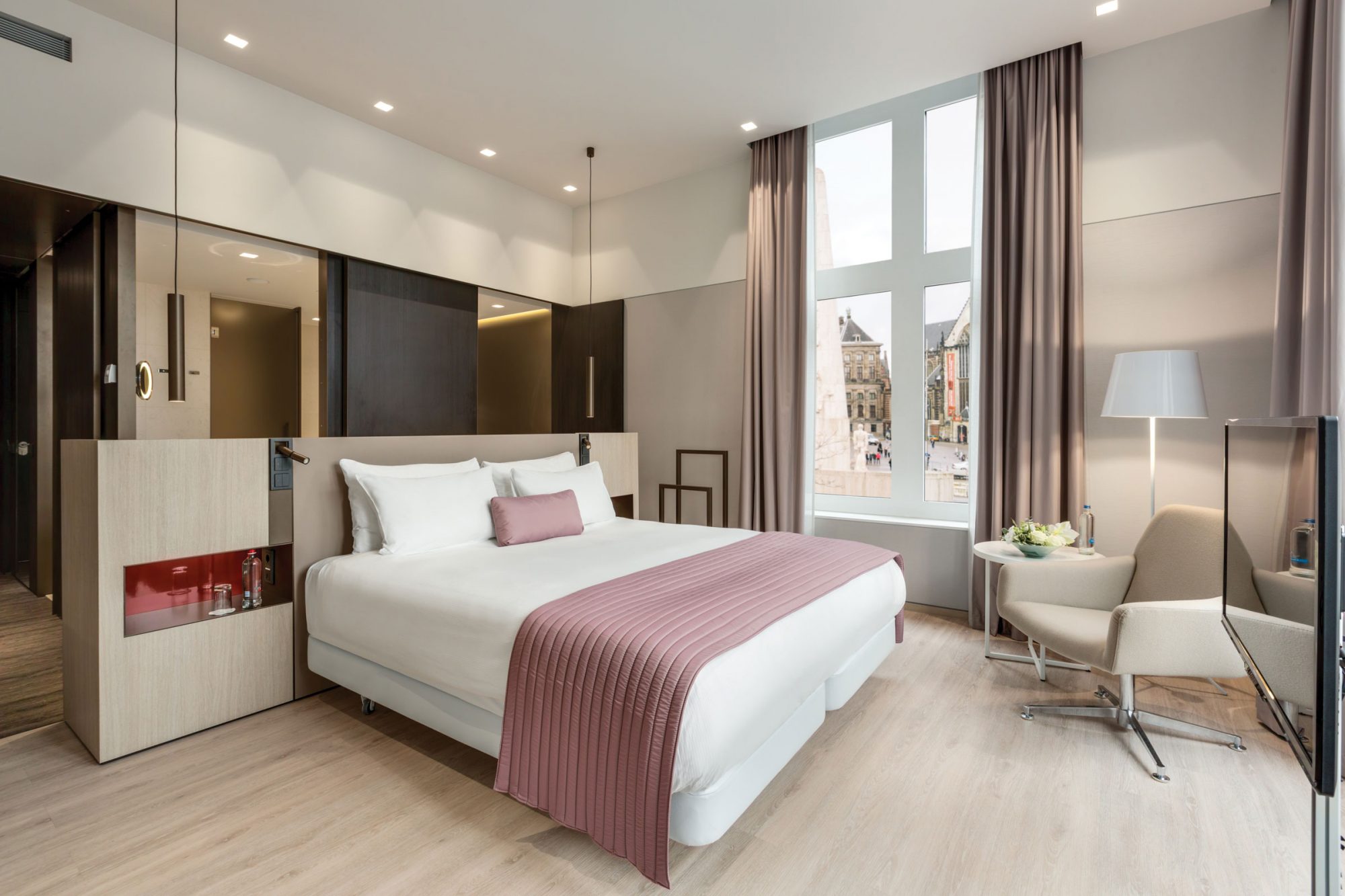
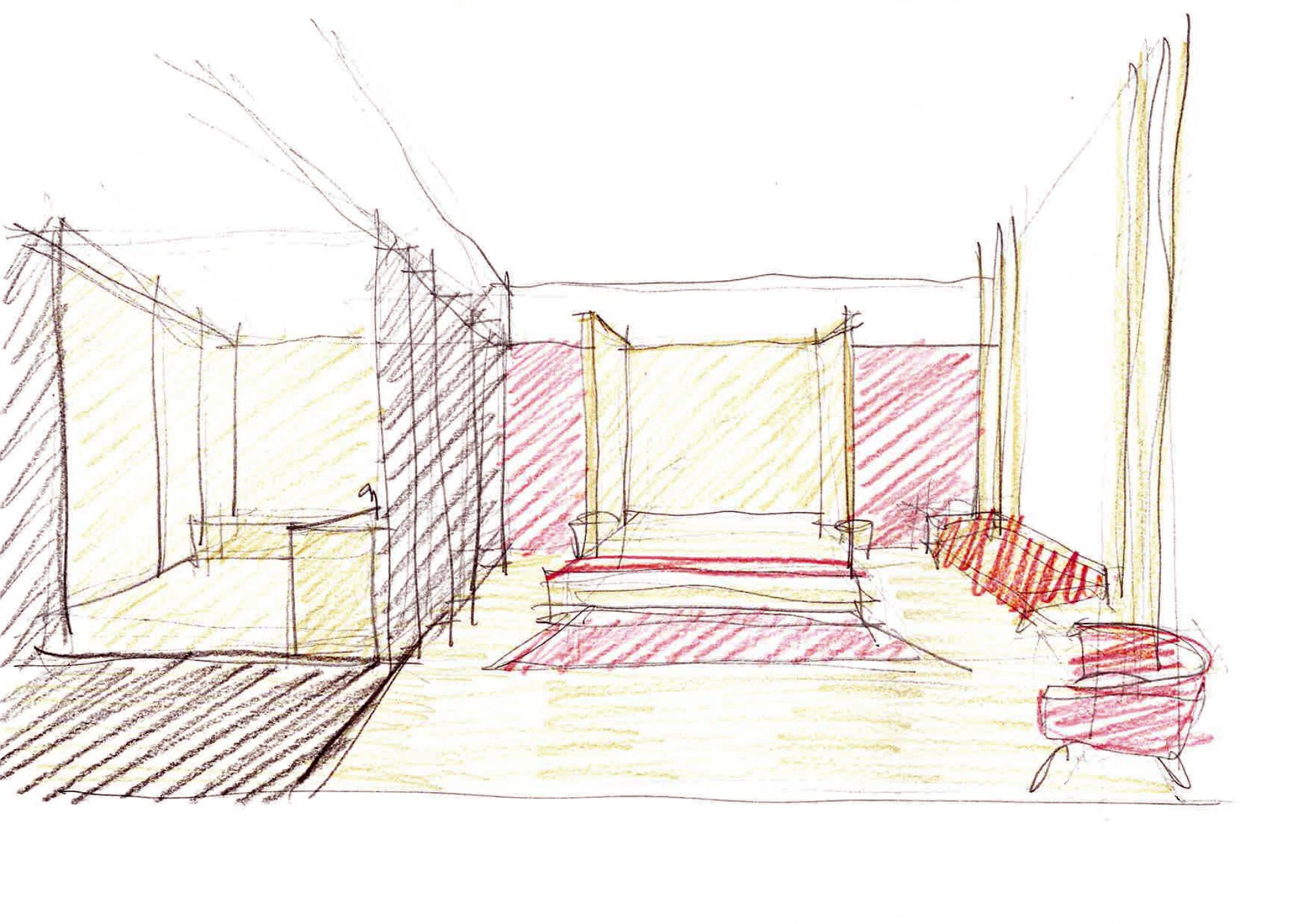
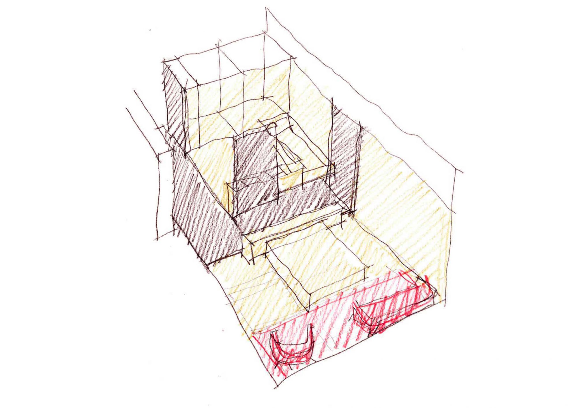
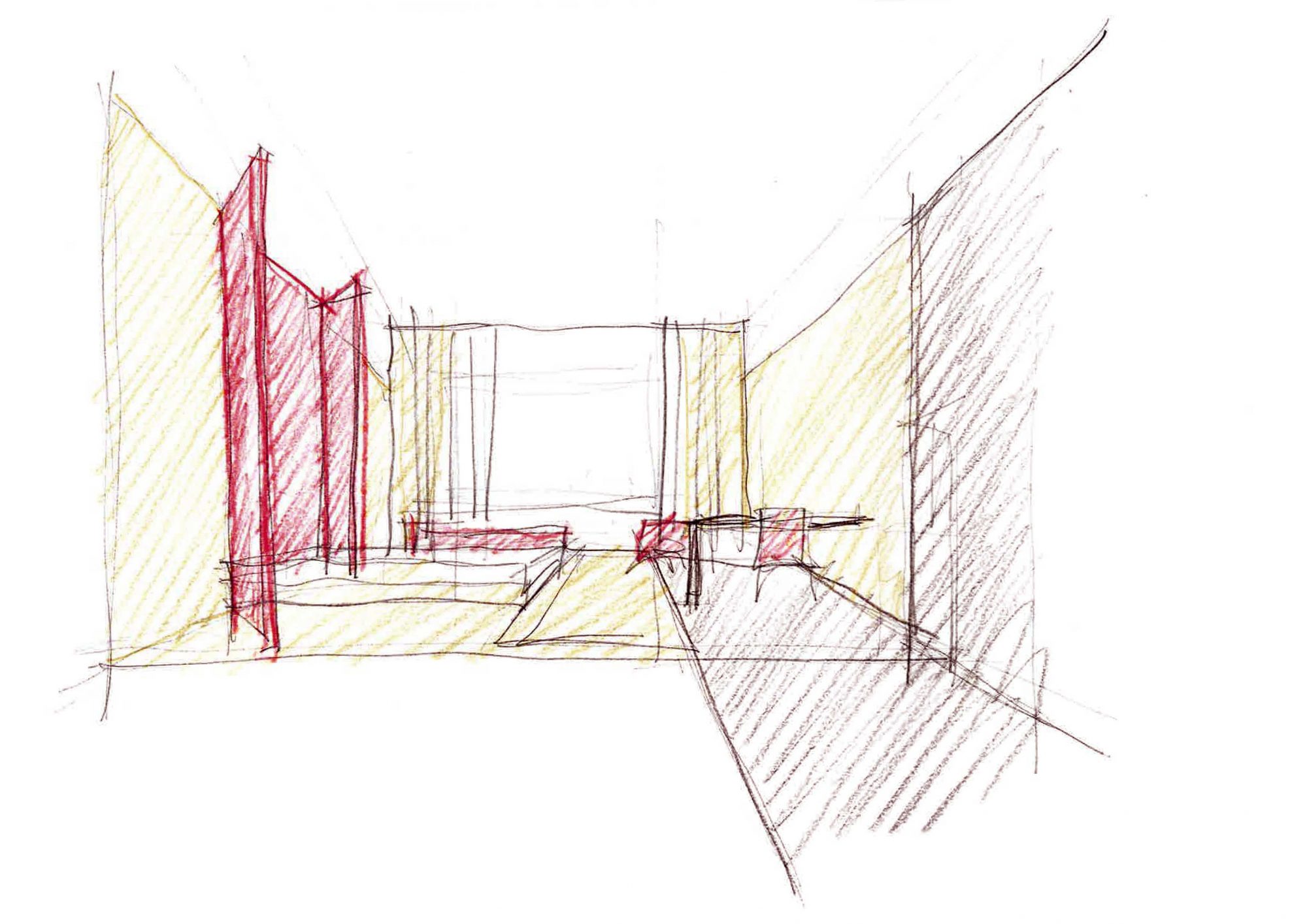
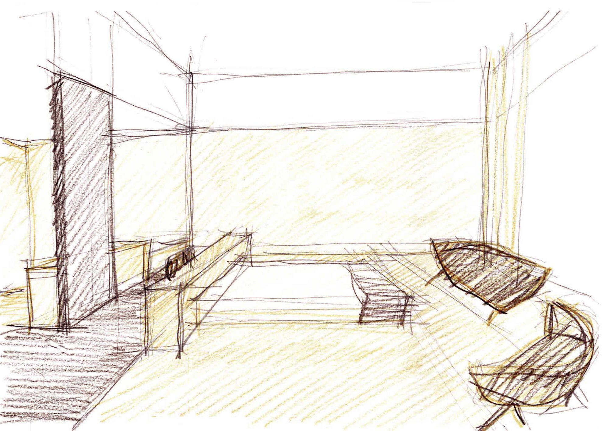
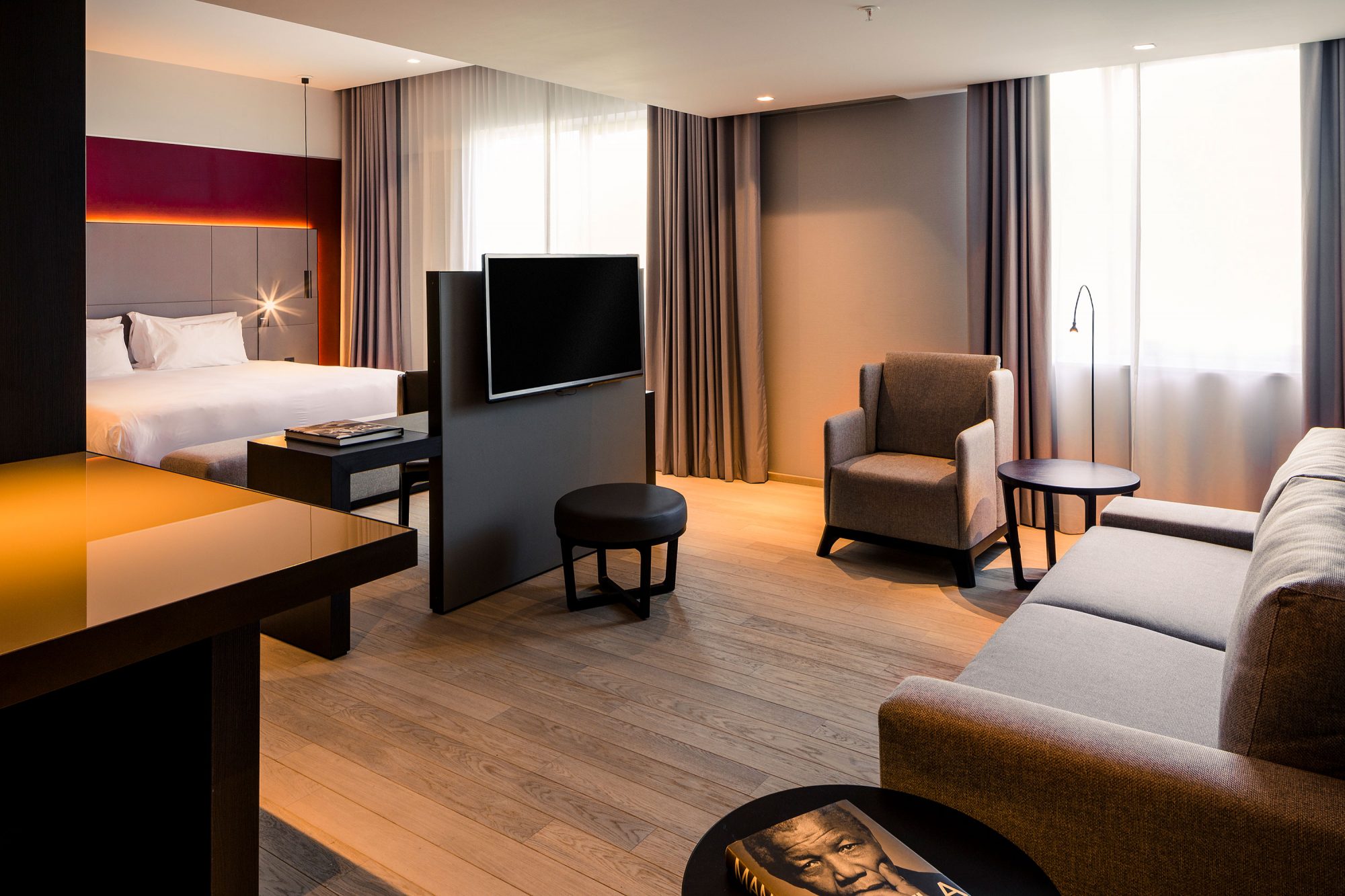
We designed two types of rooms and the presidential suite. One, with an island style centered bed, destined for the rooms located in the chamfer, and another type for the rest of the rooms in which there would be a headboard placed in the shape of an open folding screen that reminds us of Amsterdam´s large department store windows.
The result of the experience translates into an environment of high quality and comfort with contemporary language. Its colors and proportions transfer to the interior of the hotel and its atmosphere, which is so typical of the city of Amsterdam.
Game of contrasts
Through the combination of neutral colors, predominantly wood, beige limestone, and the black wood combined along with the red Krasnapolsky in its various shades, a set of extreme elegant contrasts is generated.
Access
The access door to the hotel occurs through a glass enclosure with a double mechanized door covered by a black colored canopy. It is further proposed revise the typography of the hotel sign.
-
Concept Design
Ramón Esteve
-
Design Development
D/Dock
-
Collaborators
Silvia Martínez
Jochem Straatman
Isabel Meyer
Tudi Soriano
Estefanía Pérez
Flavio Veras
Lily Lee
Svenja Stepputtis
María Martí
Víctor Ruiz
Anna Boscà
Nacho Poveda
Laura Álvarez
Thomas van Leeuwen
Laura Cano
Camila Arias -
Client
NH Hoteles
AXA Real Estate Investment Managers
