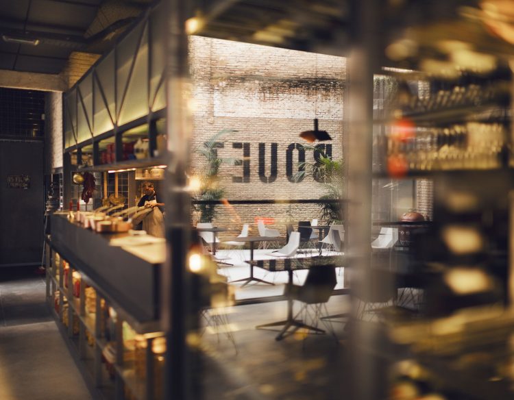
Valencia 2015 226 m2
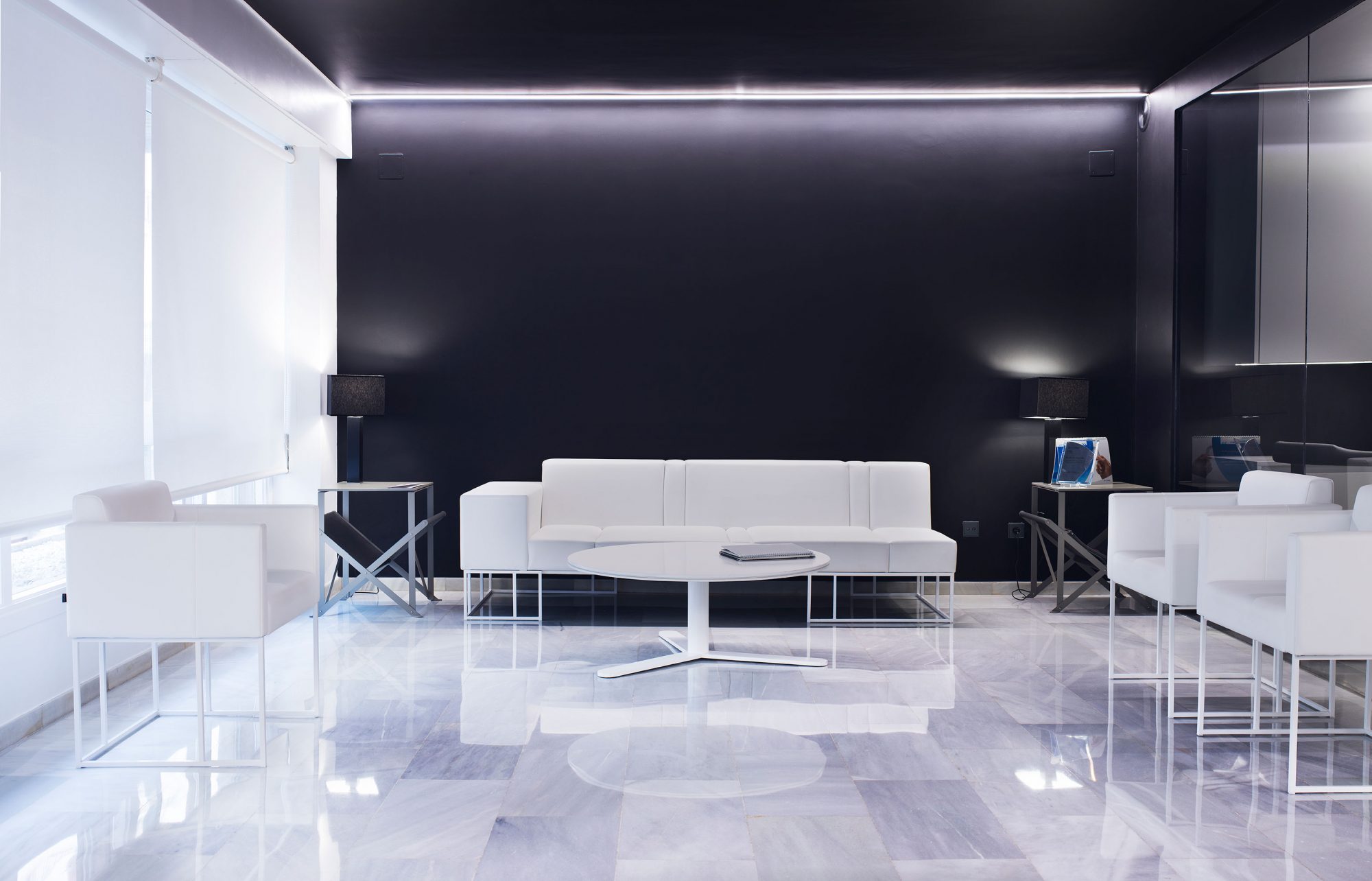
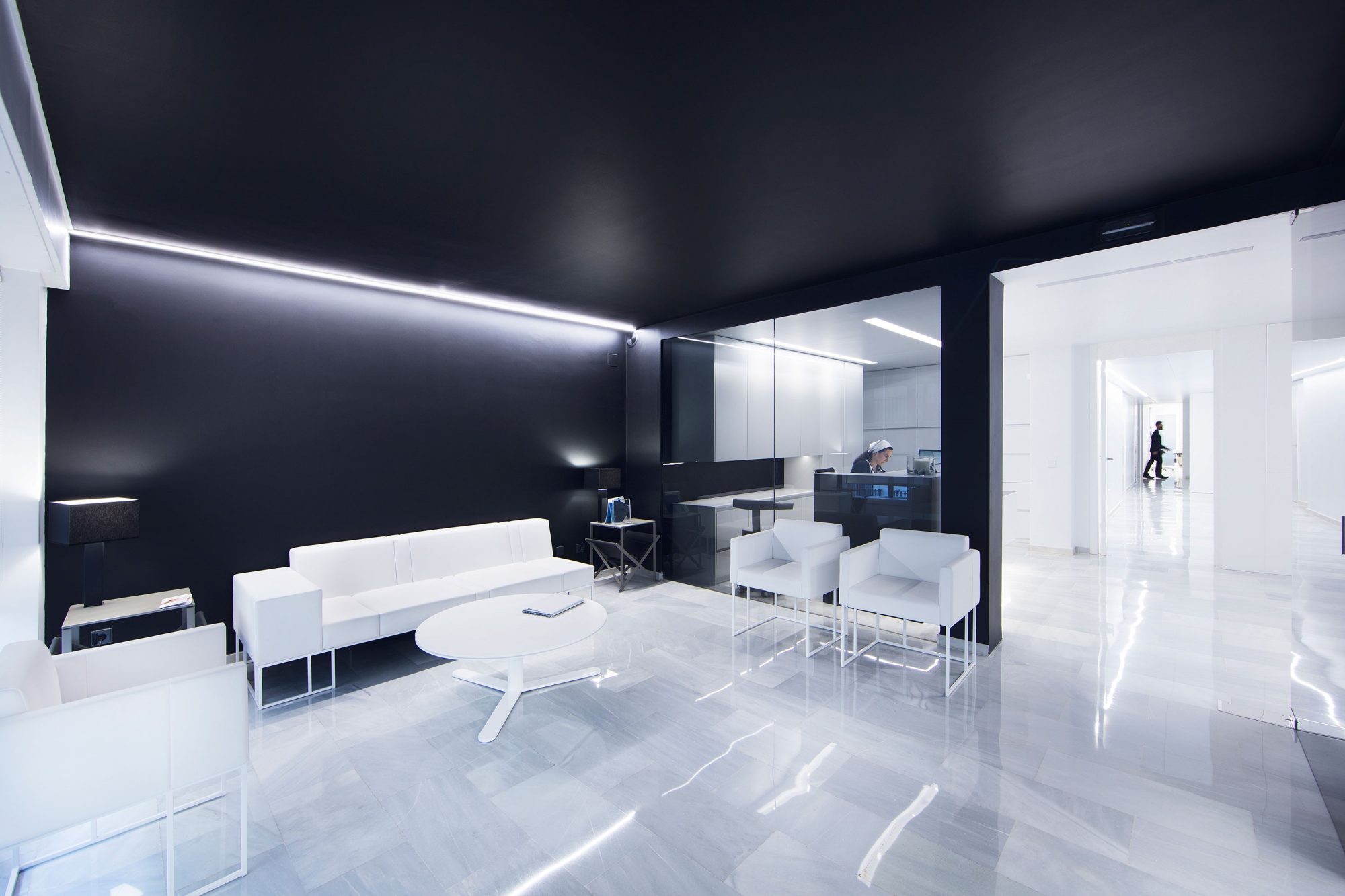
Due to the use of a combination of black and white tones, the space becomes neutral, sober and clean.
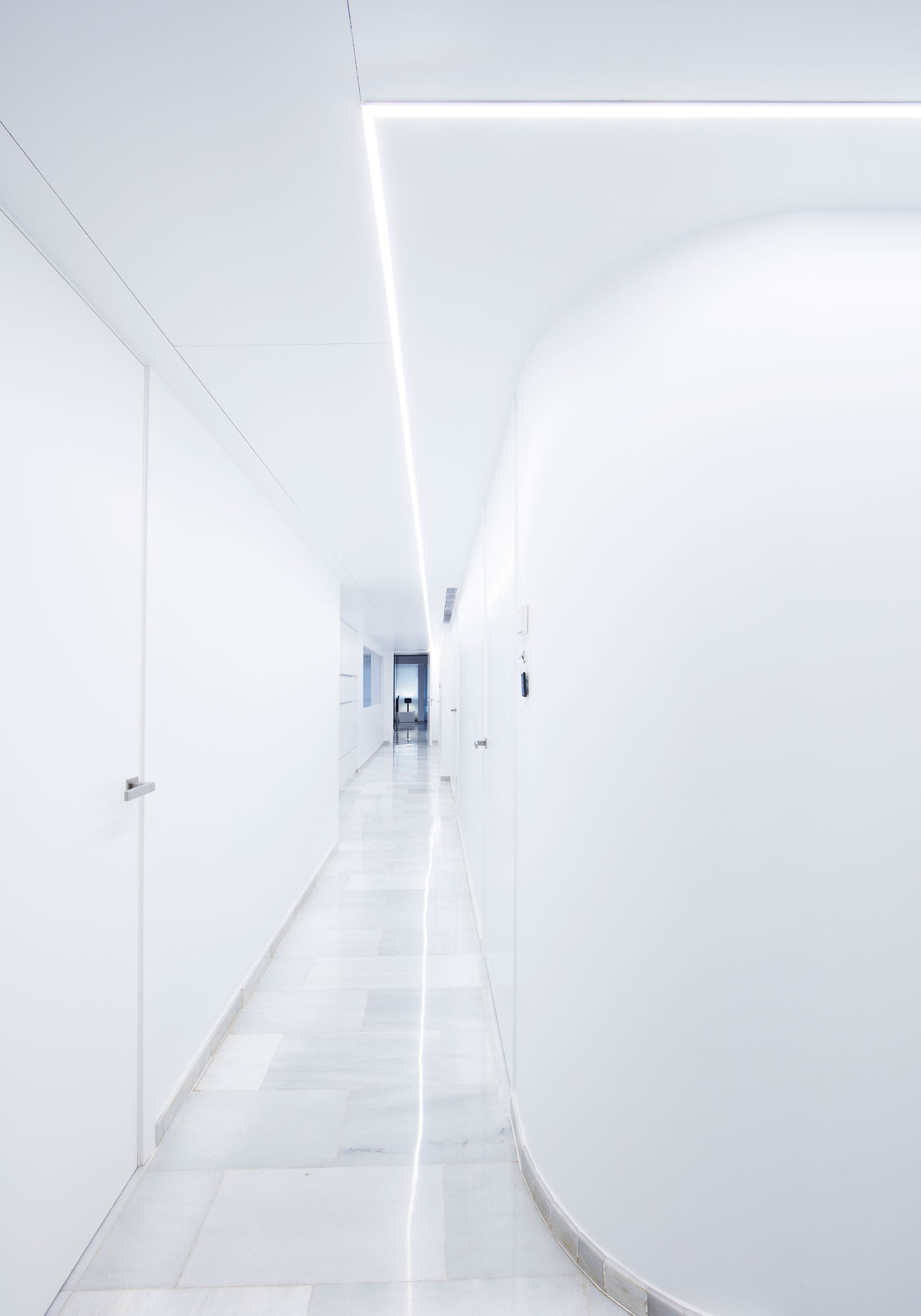
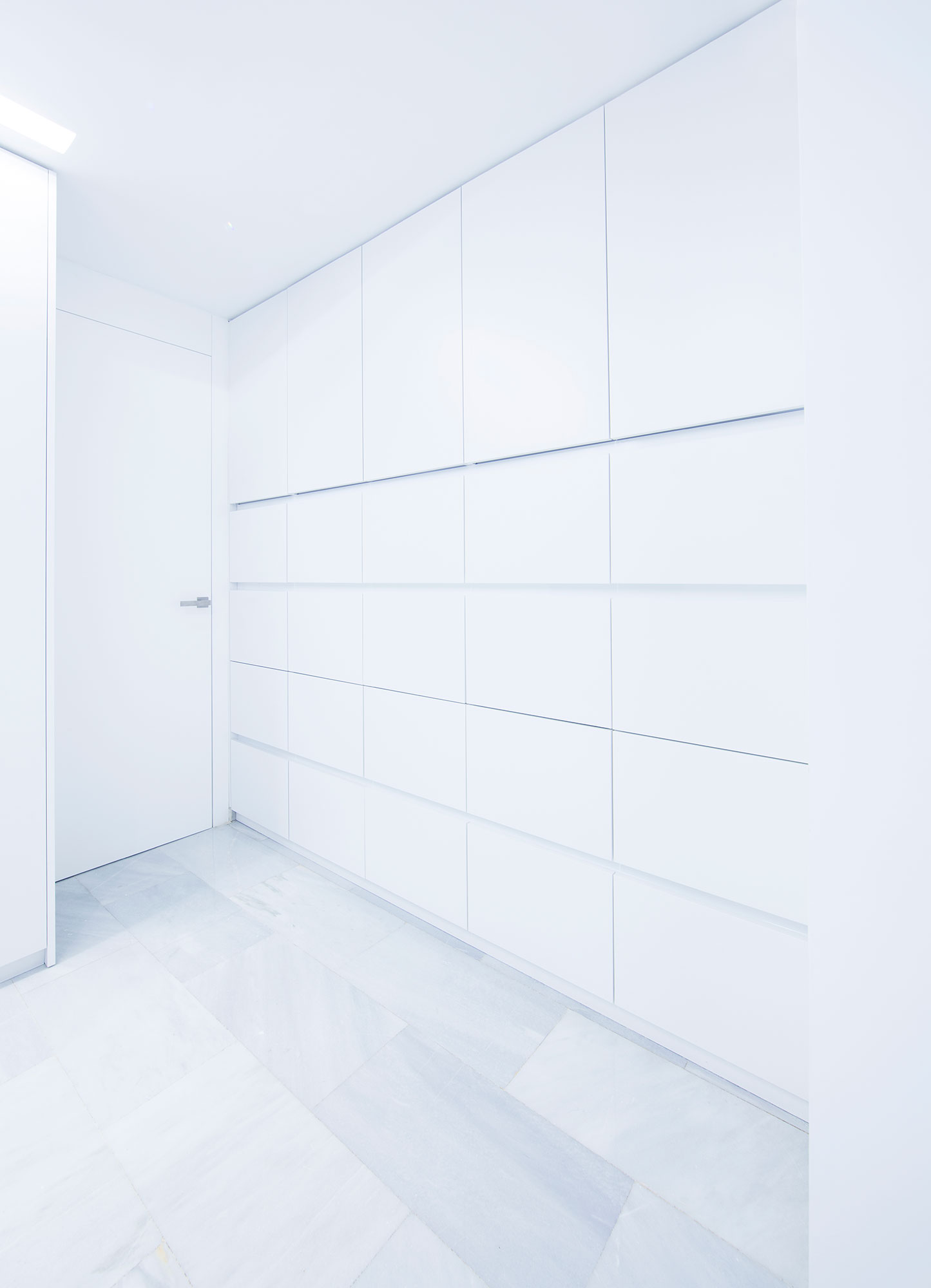
The challenge of this project is to transform a facility entirely without changing its layout and keeping some characteristic elements such as the Macael marble pavement.
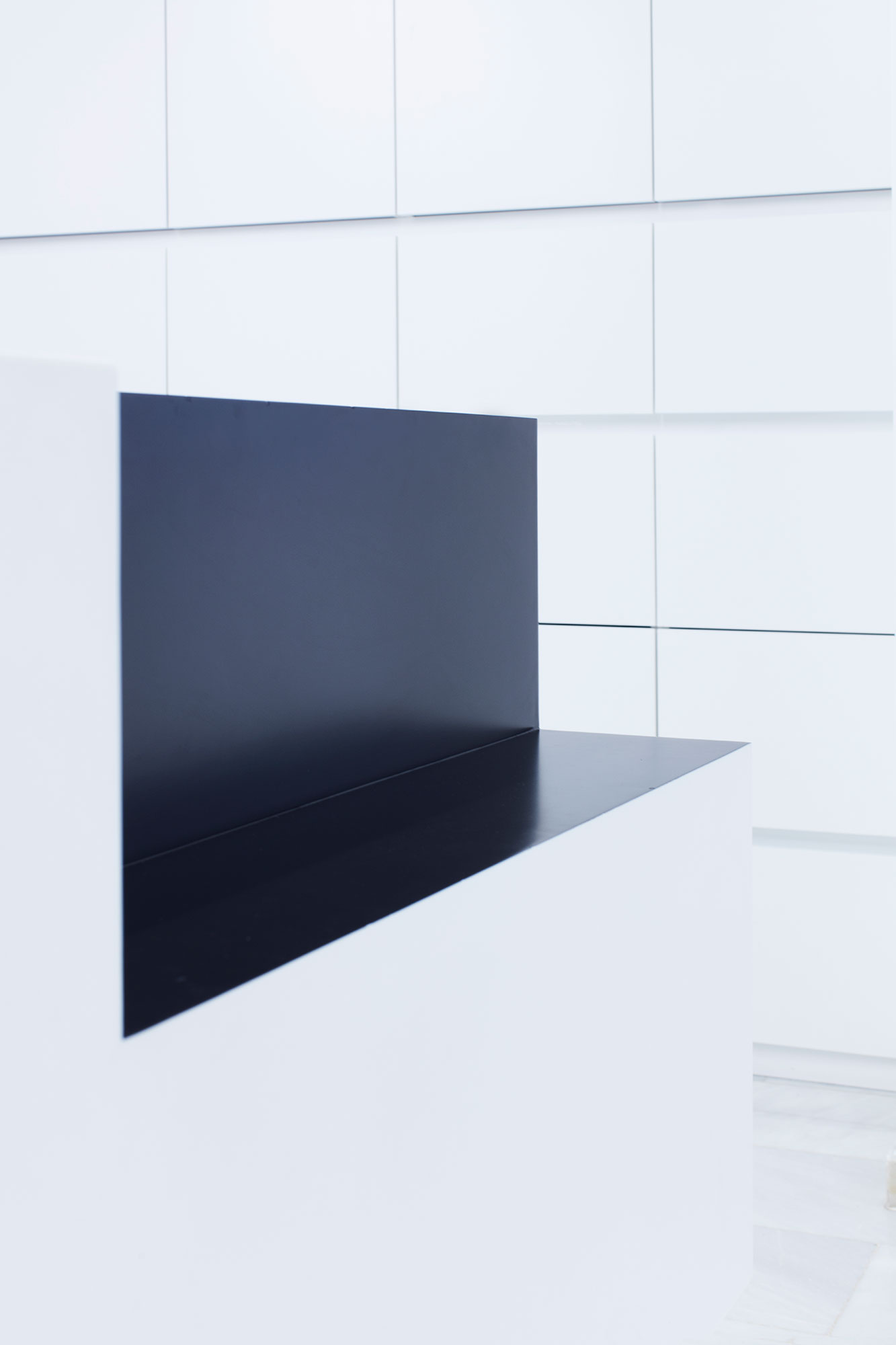
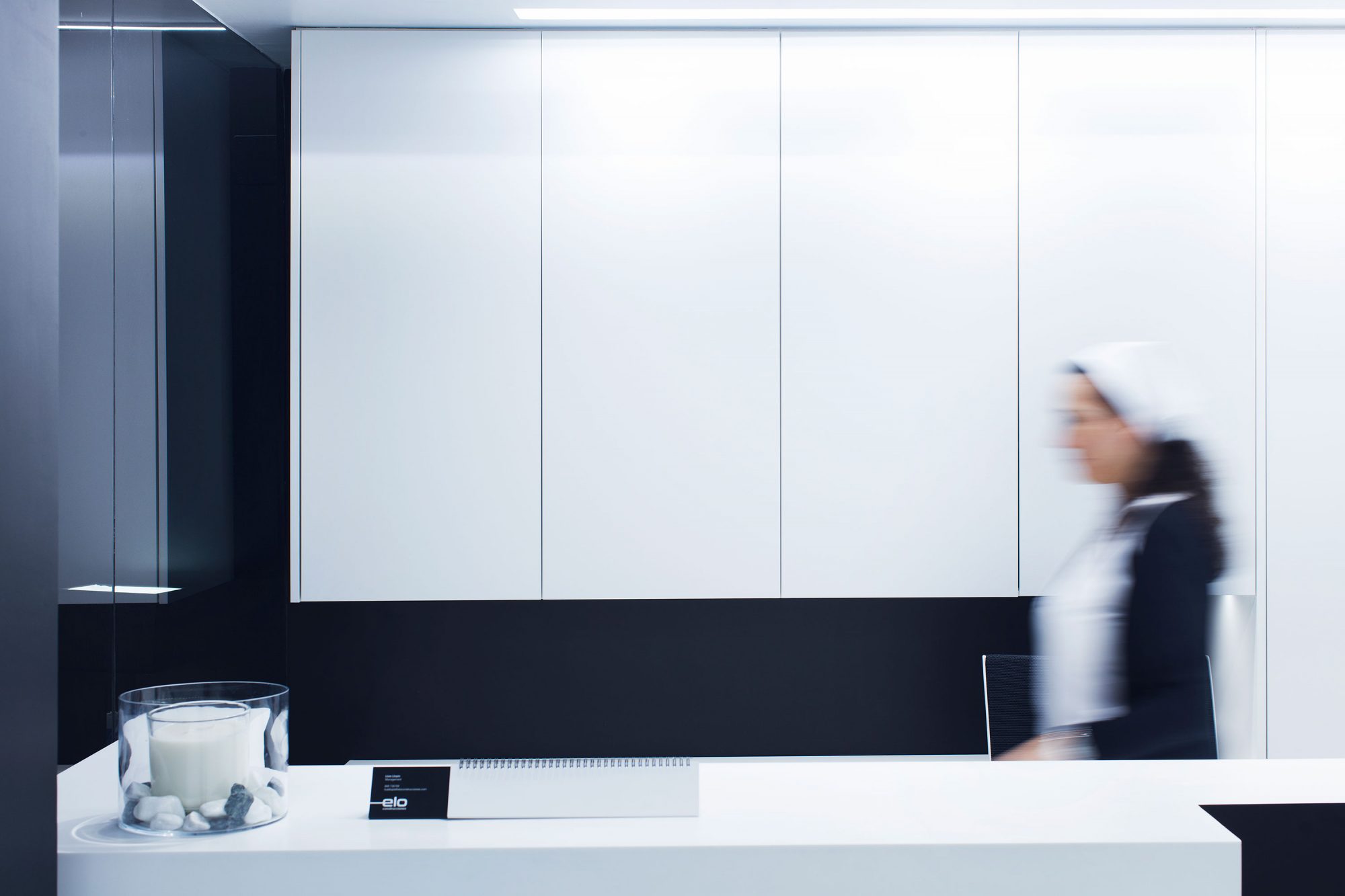
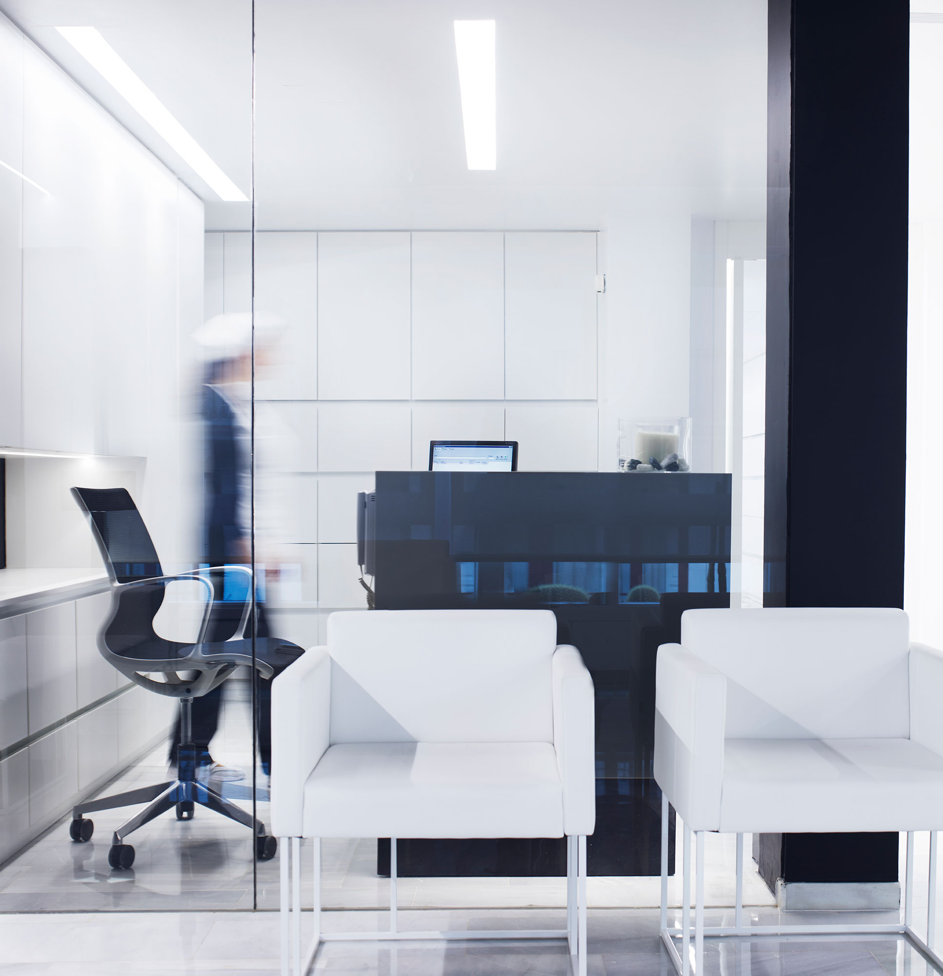
Reception desk
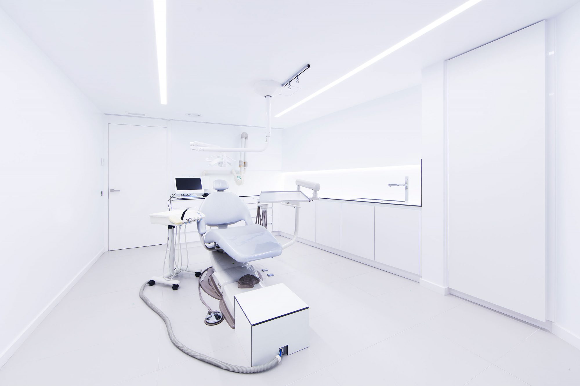
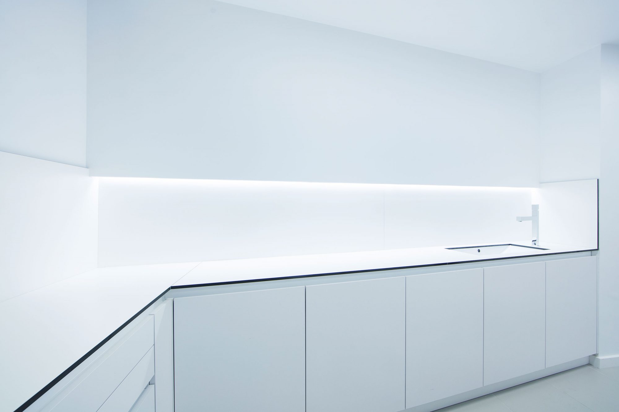
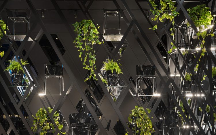
In the reception and the waiting room, the black colour is more dominant than the white one on the walls, glass panes and ceilings. However, as the rooms become more private, the white tone becomes more important. Cabinets are designed to be clean and aseptic rooms where the patients will feel safe and calm.
We have used materials that enhance the desired neutral look, such as black and white glass and lacquered or painted surfaces. Thus, the importance of the existing pavement is highlighted.
Global project
Al the furniture has been specially designed for the dental clinic. Each one of the pieces reinforces the architectural concept but keeps its functionality. The armchairs and sofas in the waiting room are part of the Elements collection of Inclass, also designed by Ramón Esteve.
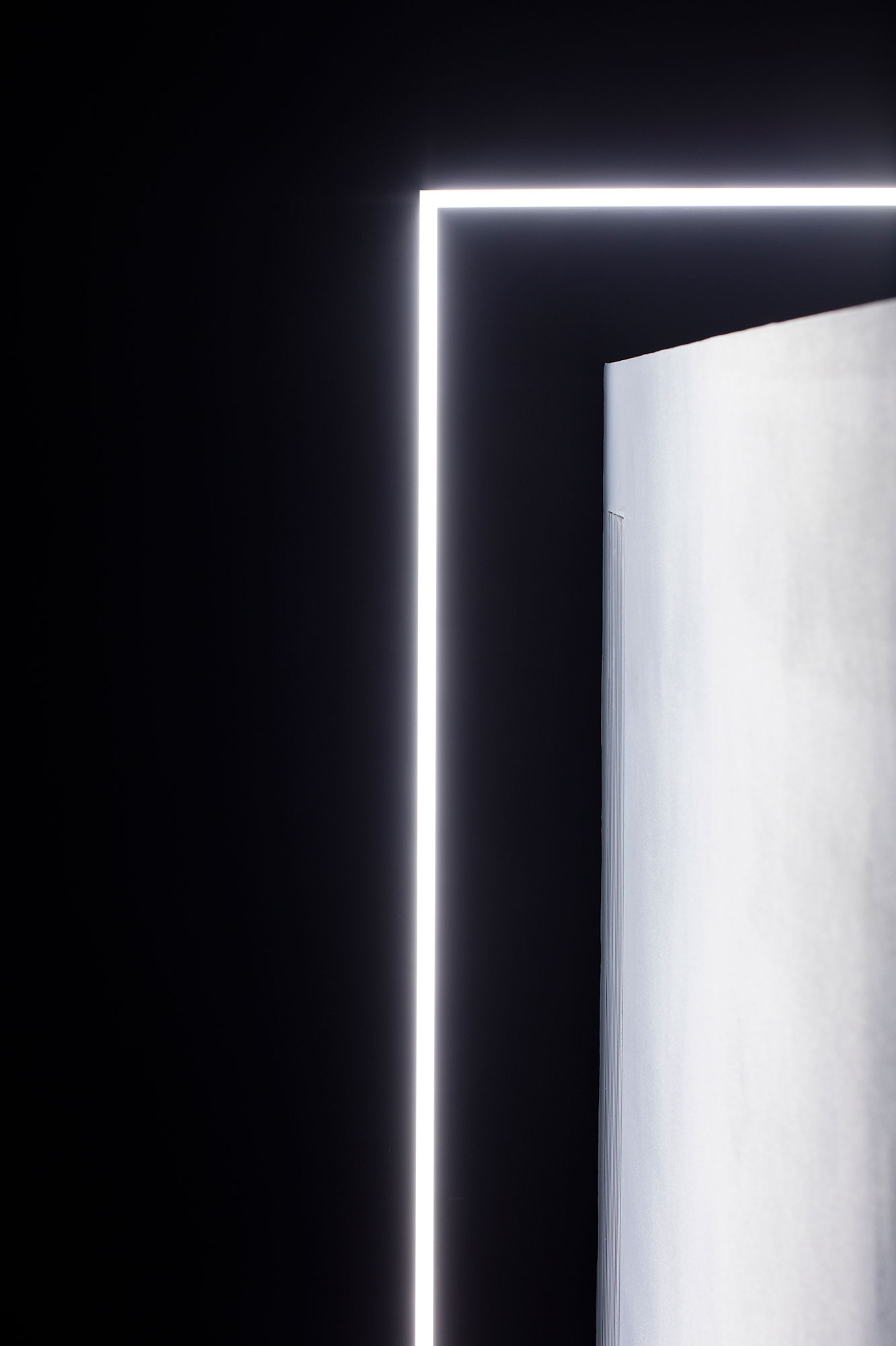
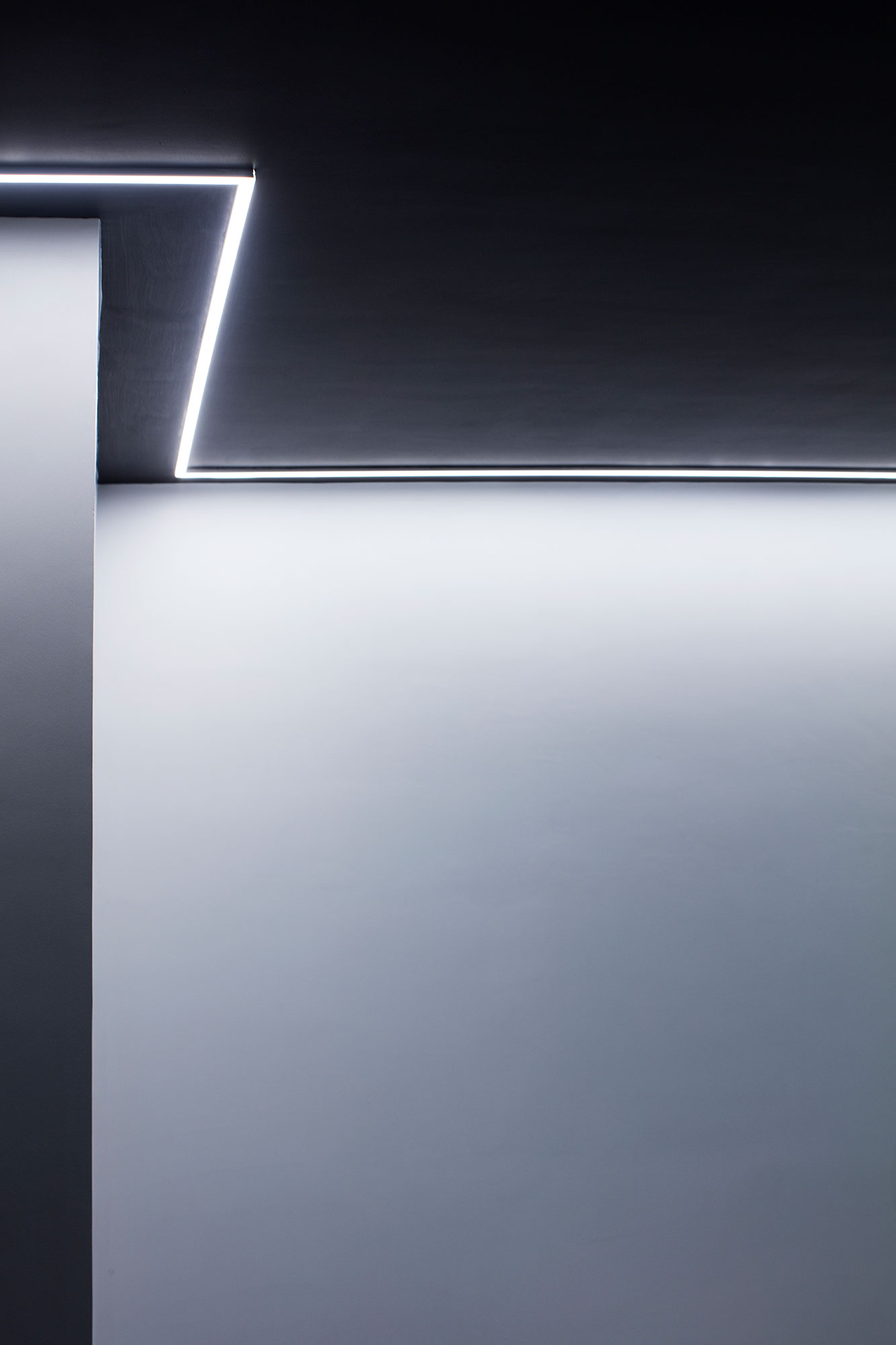
To build with light
The clinic’s lighting is made by led lamps that are integrated in the architectural elements. All the space has been illuminated with a cool colour temperature, as required for medical spaces.
Graphic design
The visual identity –exclusively typographic- is based on the same premises than the interior design: cleanness and functionality for conveying trust to the customers and projecting a modern professional image.
Both the business cards and the signing suit perfectly the interior design due to the use of a range of black, grey and white neutral tones.
-
Interior design
Ramón Esteve
-
Graphic design
Ramón Esteve
-
Collaborators
Anna Boscà
Estefanía Pérez
Isabel Meyer
Ángela Sabio
Tudi Soriano -
Constructor
Elo Construcciones

